Scroll to begin your journey
Experience Your Data
Stress data is traditionally visualized through graphs and charts, and this allows us to see patterns over time. But our brains process audio differently from visual information, revealing subtle patterns we might otherwise miss. Therefore, by combining sound with visualization, we can create a deeper, more intuitive understanding of stress responses.
Visual Only
Can you spot the subtle patterns?
Visual + Audio
The hidden pattern is clearly audible!
Multi-Sensory Perception
Your brain processes audio and visual information through different pathways, enabling you to detect patterns that might be missed visually.
Pattern Recognition
Sound naturally highlights trends, anomalies, and rhythmic patterns in stress data that aren't obvious in visual formats.
Cognitive Load
Experience how your body responds to stress without staring at numbers - sound creates an intuitive understanding.
Temporal Awareness
Sound naturally maps to time, making it perfect for understanding how stress levels change and fluctuate over periods.
Try It Yourself: Feel the Stress
Move the slider to adjust stress levels and experience how it sounds and looks in real-time.
Master the Audio Visualizer
And our audio-visual player enhances your ability to experience stress data. But different situations call for different ways of exploring this information. Therefore, we've created intuitive controls that let you customize the experience to focus on what matters most to you.
Hold to Skip
Press and hold the skip buttons to rapidly move through the data.
Compare Subjects
Switch between subjects to compare different patterns of response.
Try Different Waveforms
Each waveform emphasizes different aspects of your data.
Use Annotations
Add your own notes to mark significant events in your data.
A Practical Example
Try playing the exam dataset with different speeds to hear how heart rate increases during difficult questions and as time runs out.
Create Your Own Waveforms
And different waveforms affect how we perceive stress patterns in audio. But everyone's perception is unique, and standard waveforms may not highlight what matters most to you. Therefore, we've created tools for you to design custom waveforms that emphasize exactly what you want to hear in your data.
Sine Wave
Smooth and pure, ideal for subtle changes. Best for heart rate data.
Triangle Wave
Clear and distinct, good for moderate detail in breathing data.
Square Wave
Sharp and pronounced, emphasizes threshold crossings in GSR data.
Sawtooth Wave
Bright and detail-rich, excellent for EEG and complex variations.
Draw Your Own Waveform
Create a waveform that emphasizes the aspects of your data you care about most.
Create with Purpose
Design waveforms to highlight specific patterns in your stress data. Sharp peaks can emphasize sudden changes while smoother curves capture gradual trends. Experiment to find what helps you intuitively understand your body's responses.
Upload Your Own Dataset
And we provide sample datasets to explore the stress visualization experience. But your own biometric data contains personal stress patterns unique to your life. Therefore, Cognify makes it easy to upload, configure, and explore your own stress data, creating a deeply personal understanding of your body's responses.
Prepare Your Data
Organize your data in CSV format with these required columns:
timestamp, subject, metric1, metric2, ...| timestamp | subject | hr | gsr |
|---|---|---|---|
| 0.0 | Subject1 | 72.5 | 8.3 |
| 0.5 | Subject1 | 73.1 | 8.5 |
| 1.0 | Subject1 | 73.8 | 8.7 |
Upload Your File
Drag & drop your CSV file here
or
Configure Your Dataset
Start Exploring!
Your dataset will appear on the main albums screen, ready for exploration.
Using Apple Health Data
Your Apple Watch or iPhone already collects valuable stress-related metrics like heart rate and variability. Here's how to export and visualize it:
Export Your Apple Health Data
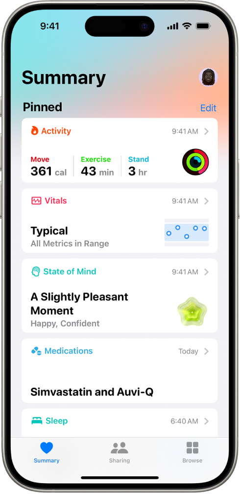
Open the Health app and tap on your profile
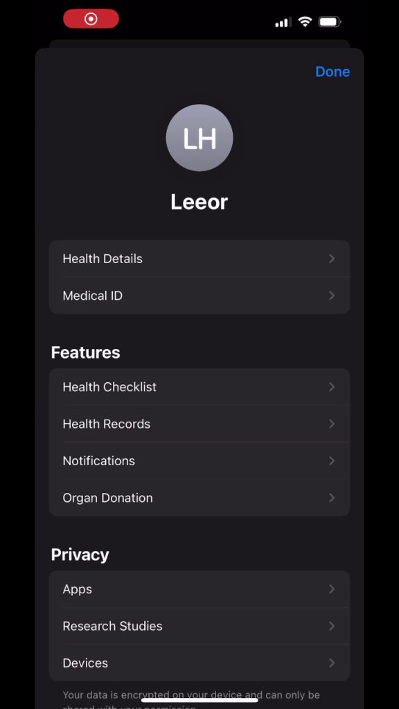
Scroll down and tap "Export All Health Data"
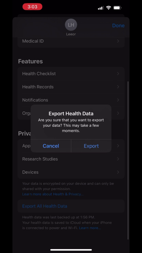
The data will be exported as a ZIP file - share it to your computer
Upload and Configure
In the upload section, select "Apple Health" instead of "CSV":
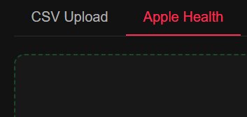
Select Metrics to Visualize
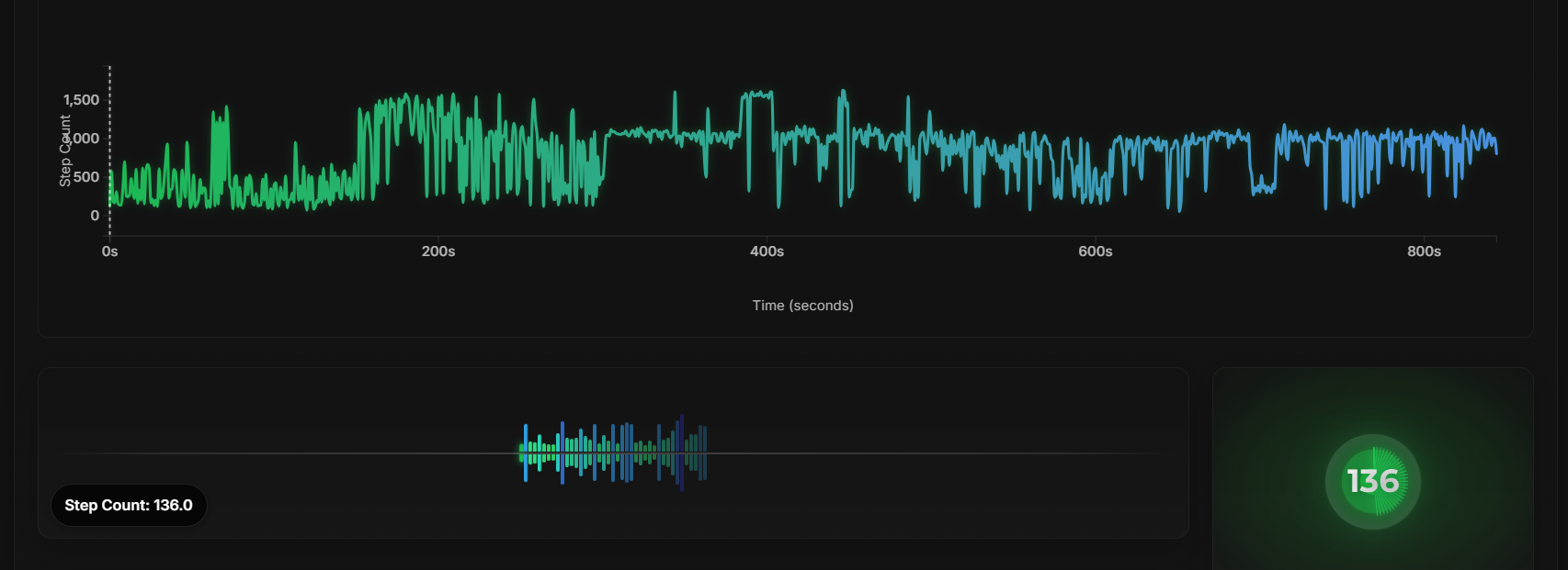
Choose from available metrics like Heart Rate, Active Energy, or Steps:
Heart Rate
4,235 data points (bpm)
Active Energy
982 data points (kcal)
Steps
731 data points (count)
Visualize and Experience
Your Apple Health data will be processed to create a seamless audio-visual experience that reveals patterns in your physiology you may never have noticed before.
Pro Tips
Consistent Sampling
For best results, use data with consistent time intervals between samples.
Normalize Your Data
Pre-normalize extreme values to prevent audio distortion.
Add Event Markers
Include an "event" column to mark important moments in your study.
Multiple Metrics
Include multiple metrics (HR, GSR, etc.) to get more complete insights.